
No. 01 | September 2026
The Bernard Edit No. 01
A note from Joshua on point of view, material studies, and the details currently shaping his work.

A Note from Joshua
Lately, I’ve been thinking a lot about what it means to have a point of view without having a signature look.
I’ve always said I never want two of my projects to look remotely the same. In fact, I don’t necessarily want someone to walk into a room and immediately say, “Joshua designed this.” I’d rather they say, “This feels so completely like the person who lives here,” and only afterward, when they learn I designed it, does it make sense.
My Houston project is challenging that philosophy in the best way. The architecture is more modern than much of my previous work, and my clients’ taste is pushing me to consider furnishings, materials, and combinations in ways I haven’t before.
I’m realizing that perhaps having a point of view isn’t about repeating an aesthetic. It’s about having a consistent way of seeing things. Right now, I’m excited to see where that takes me.
The Short List
01. Ambre Levant + Mentor
For the past month, I’ve been layering Louis Vuitton’s Ambre Levant with Mentor by Mind Games, and I genuinely cannot leave the house without someone asking what I’m wearing. The combination opens rich and warm, then settles into something unexpectedly sweet and intriguing. It lingers without becoming overwhelming, the kind of fragrance you notice again hours later. For me, it’s the perfect transition into fall.
02. Concave Mirrors
I’ll find an excuse to bring a mirror into almost any room, but lately I’m especially drawn to concave mirrors. Unlike a traditional mirror, where the frame often provides the decorative moment, a concave mirror makes the reflection itself the art. There’s something almost sculptural about the way it distorts a room, catches sunlight, and changes depending on where you’re standing.
Yes, there’s a faint resemblance to those old convex security mirrors found in garages, which may be part of why I find them so interesting. Taken out of context and used intentionally, they become something entirely different. With the right surroundings, they can live beautifully within almost any style of interior.

03. Roman and Williams Candles
Specifically, Nuit Du Guild by Roman and Williams Guild. Leather, amber, patchouli, suede, vetiver, musk, and cedarwood. The notes read almost like a material palette for a room I’d want to design. It’s warm without being overly sweet, woody without becoming too masculine, and has that slightly sexy quality I’m always trying to create in an interior. Perfect for fall, but really, perfect for any room that should feel intimate, layered, and lived in.
Material Study
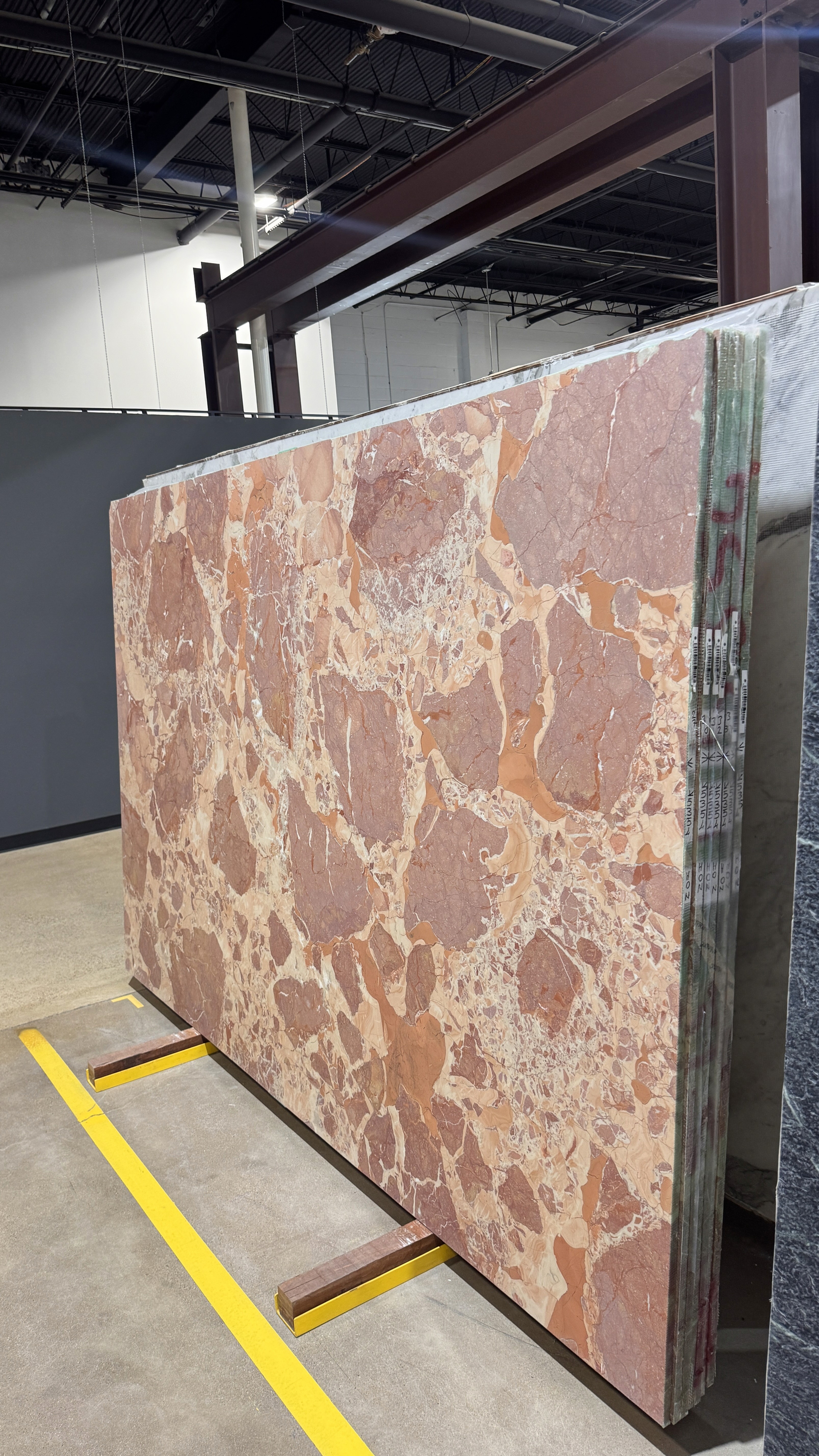
Breccia
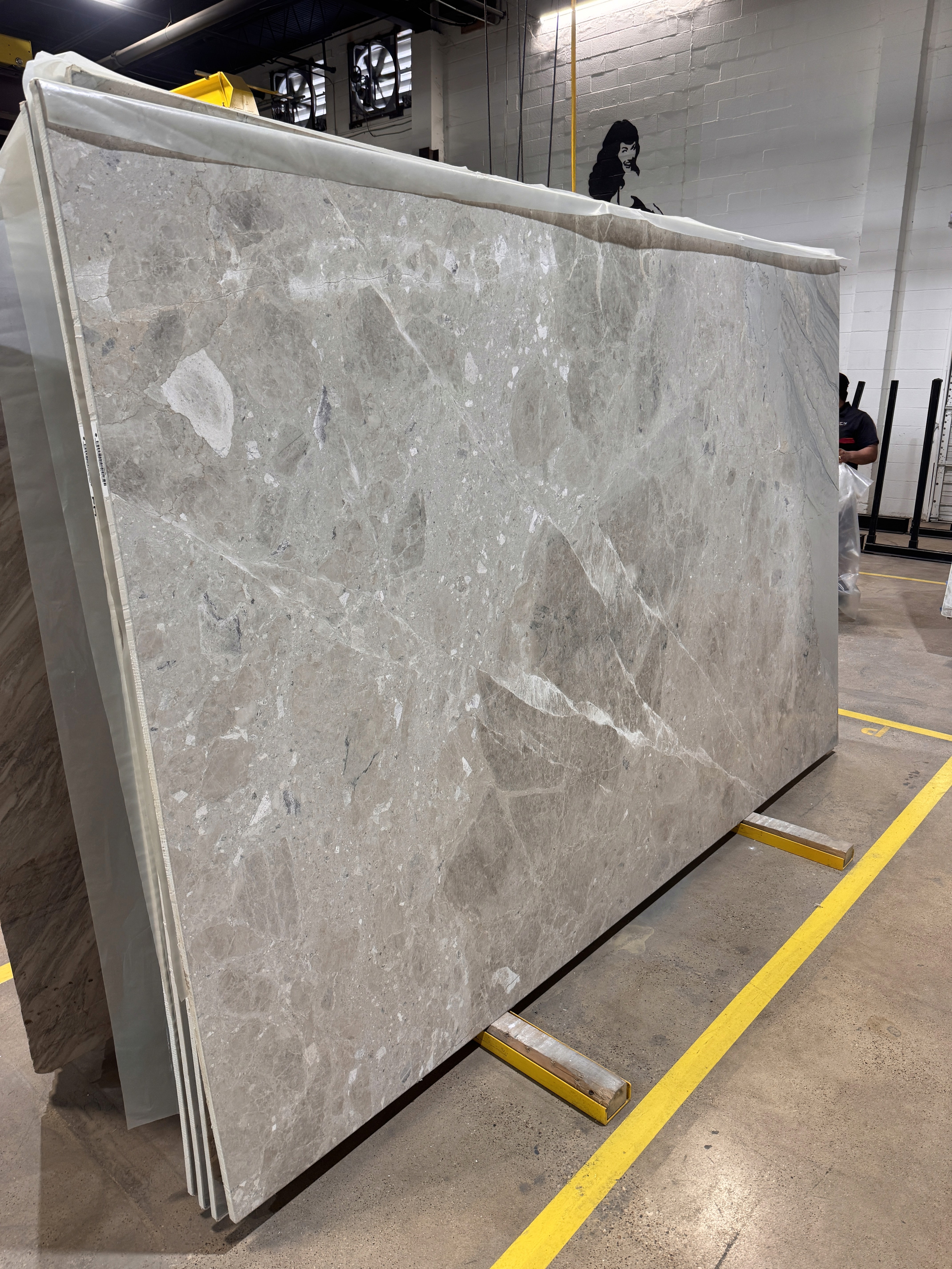
I find myself increasingly drawn to stones that feel a little less expected. Taj Mahal quartzite is quickly becoming, in my mind, the Calacatta Gold of this decade. It is timeless, neutral, beautiful, and increasingly ubiquitous. There will always be a place for it, particularly when it’s exactly what a client loves, but lately I’ve been craving slabs with a little more unpredictability.
Breccias, in seemingly every variation, have completely captured my attention. What I love is their ability to hold an entire palette within a single slab. Cream, taupe, rust, plum, chocolate, gray. You can decide which note to pull forward and allow the rest of the room to respond.
I’m currently installing one throughout a powder room, and it perfectly demonstrates the duality I love about the material. Left to speak naturally, breccia can feel incredibly organic. Fabricated and installed with precision, it can take on the presence of the most luxurious Italian marble. The stone doesn’t dictate the room. It gives you somewhere to begin.
Would Specify
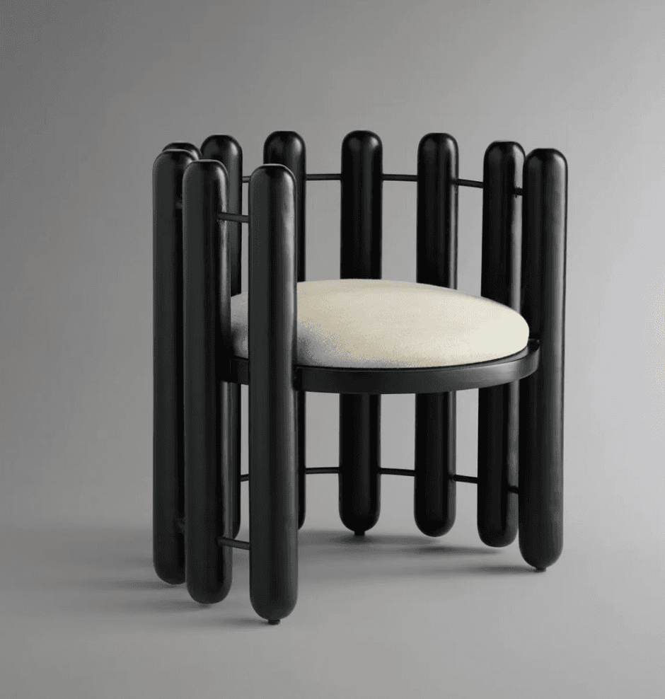
The Meridian Chair | MOUS
Currently at the forefront of my mind is the Meridian accent chair by MOUS. In its simplicity, it presents almost as an understated piece of sculpture. The disciplined vertical lines of the outer shell meet the softness of the curved seat in a way that feels architectural without becoming severe.
It’s also remarkably versatile. I can imagine it against antiques just as easily as I can within an entirely contemporary room. I’m hoping to incorporate it into my Houston project, a modern home architecturally, but one where the furnishings will lean toward a kind of minimal eclecticism. The Meridian feels particularly right for that tension.
It’s the kind of piece I’m always searching for, one that can start a conversation without demanding the entire room revolve around it.
On My Radar
Restaurant Interiors
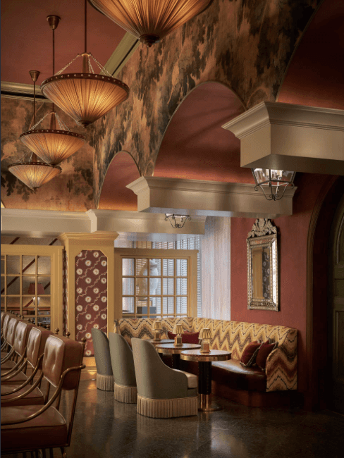
Dallas has seen its share of restaurants come and go, but over the last decade especially, dining here has become as much about the room as what arrives on the plate. One currently at the top of my list is Scilla Coastal Italian.
The interiors were designed by Sees Design, my fellow Kips Bay Dallas 2025 designers, and the restaurant is another example of just how transportive a dining room can become when every detail feels considered. From the lighting to the tasseled skirts on the dining chairs, there’s an apparent intention behind even the smallest gestures. We’ve reached a point where beautiful interiors are almost expected from fine dining, but I still appreciate a restaurant that reminds me why atmosphere matters. The best spaces don’t simply look beautiful. They change the way an evening feels. And, of course, beautiful interiors paired with pasta and wine certainly don’t hurt.
From the Studio
Mixed Metals
Mixed metals. A design detail that has plagued society, or at least generated far more anxiety than it deserves. What I’ve realized is that mixing metals isn’t really about following a rule. It’s about intention. That intention is what separates something that feels careless from something that feels effortless.
In my University Park project, a 1940s Colonial already bursting with character, we’re embracing that idea down to the smallest details. My clients are from Louisiana and aren’t afraid of the juxtaposition that gives a collected interior its soul.
An unlacquered brass chain suspending a Murano chandelier above the dining table can coexist with the antiqued pewter frame of an important piece of art. In the formal sitting room, the antique brass of a 1920s Italian crystal chandelier meets oil rubbed bronze cabinet hardware. They don’t match, and they shouldn’t. When those decisions are made deliberately, the metals begin to feel accumulated rather than specified. In an older home especially, that layering adds another chapter to a story that began long before we arrived.
Postcard
Chicago
Chicago has slowly become a home away from home, but until this year, I don’t think I had ever given myself enough time to truly experience it. Somewhere in that process, I’ve also rediscovered my appreciation for nature and the combinations of color, texture, light, and imperfection that exist without anyone having designed them.
I recently bought a camera, and now I take it with me whenever I can. What began simply as wanting to document what I was seeing has unexpectedly found its way back into my work. I’ve started returning to those photographs when thinking through color palettes, textures, and material combinations.
It makes sense. So much of what we use in interiors begins in nature: stone, wood, metal. Their beauty often comes from the very thing we can’t manufacture perfectly. The veining, patina, grain, and variation each tell their own story. Perhaps that’s the lesson I’m taking home with me. Sometimes the most compelling design begins by paying closer attention to what was already there.


Until Next Time
Consider this the beginning of an ongoing conversation about the things that catch my eye, challenge my thinking, and ultimately find their way into my work. Some months that may be a stone I can’t stop specifying. Others, a room I can’t stop thinking about, something discovered while traveling, or simply an object too beautiful not to share.
I hope The Bernard Edit becomes a place you return to for a little inspiration, a new discovery, or perhaps a different way of seeing something familiar.
Until No. 02, Joshua